Wellbeing tech / methodology · Case study
Designing for wellbeing, not engagement
Sweatty: a versioned design system (v4.0) and a 22-principle ethical-design framework for wellbeing tech, built to refuse dark patterns at the component layer.
- Design system v4.0
- 22-principle ethical-design framework
- Component-level pattern constraints
- Motion tokens (bounded delight)
- Notification cadence primitives
- Low-saturation calm-by-default palette
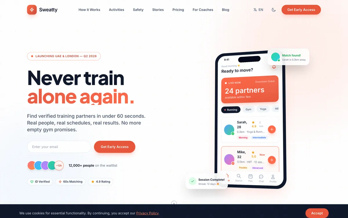
Sweatty is the methodology case study in this set, and it is deliberately different from the others. There is no growth-chart screenshot to point at, because the artefact is not a shipped consumer feature. The artefact is the discipline itself: a versioned design system (v4.0) and a 22-principle ethical-design framework for wellbeing technology, built so that the product does the right thing by construction rather than by good intentions.
Most case studies in this set answer “what does your code look like?” This one answers a harder question: what does your design discipline look like when nobody is watching?
Why methodology counts as a case study
Most case studies surface code and outcomes. This one surfaces a refusal, and encodes it.
Sweatty’s brief is wellbeing tech: software whose stated purpose is to help people feel better, sleep better, move more, and be more present. The dominant pattern in that category is what we call dark wellbeing tech: apps that promise wellbeing while quietly monetising attention through streak shame, notification floods, social comparison, and reward loops tuned for retention rather than for the person using them.
Sweatty refused that pattern at the brief level, and the framework is where the refusal becomes concrete. These are the things the system will not do:
- No streak-based shame mechanics
- No social-comparison leaderboards by default
- No “your friends are using X” notification patterns
- No dark-mode-only at night; light-mode-by-day discipline is kept
- No “wake the user up” engagement loops
- No infinite scroll on content surfaces
- No deferred “would you like to enable notifications” prompts that resurface after they are dismissed
The important move is that these are negative requirements, things the product must not do, and negative requirements are exactly the kind that erode under commercial pressure unless something enforces them. So the design system enforces them as token-level rules: certain animations are forbidden, certain notification cadences are blocked at the component layer, and certain visual reward patterns are simply not in the library to be reached for.
The artefact set: a system and a framework
Two source documents anchor the work, and they play different roles.
Sweatty Design System v4.0 is the fourth major iteration, and the version number is the point. This is multi-year methodology work, not a one-pass style guide. Each version is documented, and the changelog between v3 and v4 marks the moment the ethical-design principles stopped being aspirational prose and became enforceable component constraints. That is the difference between a design system that recommends restraint and one that makes the un-restrained version impossible to build.
22 Ethical Design, Wellbeing is the companion framework, with associated media. Its 22 principles cover the dark patterns to avoid, the light patterns to prefer, and, most usefully, a decision tree for the ambiguous cases the category actually argues about: when is a streak acceptable? When is social comparison constructive rather than corrosive? The framework does not pretend those questions are easy. It gives a defensible way to answer them the same way every time.
The deliverable shape is unusual but portable. Many wellbeing-tech products would benefit from importing the principle set wholesale, independent of whatever UI framework they happen to run on.
Why a design system has to reach v4.0
If you are designing for wellbeing seriously, you cannot get there in one pass. You have to test each principle against real product decisions, repeatedly, because every test surfaces edge cases the previous version did not anticipate.
A naive design system says use the right colours, the right typography, follow the patterns. That is a v1.0 statement. By v4.0 the system carries harder guarantees:
- Component-level constraints encoded in code, so button and reward variants cannot express a dark pattern even when someone tries.
- Motion tokens that bound the sense of delight: no celebration explosions, no haptic pump, no animation whose job is to make the app feel more compulsive than it is.
- Notification primitives that respect cadence at the platform layer, so the fifth push of the day cannot be sent even by mistake.
- A visual language that signals calm by default: a low-saturation palette, generous whitespace, and slow, unhurried animation.
- Documentation that records the why behind each constraint, not just the that, so the reasoning survives when the team changes.
Read plainly, the “v4.0” label is shorthand for a claim you can inspect: this has been tested against real product pressure for years, and the ethics are load-bearing in the code, not decorative in a slide.
What UK Web Marketing imports from it
If you are building anything in the wellbeing or healthcare-adjacent space, a fitness studio booking site, a yoga teacher’s directory, a mental-health practice’s enquiry flow, the Sweatty methodology is the lens worth borrowing. It also feeds directly back into how we build.
Concrete things we carry across from the framework into client work:
- No streak-shame copy. Our pillar pages do not use “365 days of compliance” or “do not break your streak” framing to manufacture guilt.
- No social proof that implies other users are watching. An honest “as featured in” logo strip is fine; a fabricated “127 people booked this week” counter is not, and we will not build one.
- No dark patterns in the form flow. Contact, audit, and lead-magnet forms have a single primary action, no pre-checked consent boxes, no exit-intent “are you sure you want to leave?” dialogs, and no “limited time” countdown timers.
- Calm by default. Colour is saturated only where attention is genuinely warranted, and the same restraint carries through to the OG images we generate for articles.
If that kind of discipline is the work you want, particularly in wellbeing, mental health, fertility, paediatric care, or any sector where an engagement-optimised dark pattern would be ethically wrong, get in touch. Same accountable team, same pricing approach, same Sweatty-informed editorial discipline.
What this case study is not
It is not a story about a launched consumer product with growth charts. There is no monthly-active-user figure, no revenue number, no “we hit profitability in month six” milestone, and we are not going to invent one. The work sits upstream of all of that: a methodology that could be applied to a wellbeing product, documented at v4.0 maturity.
That is worth publishing precisely because it answers the question a specification sheet cannot. Anyone can promise they design ethically. Very few can show you the version-controlled system that makes the unethical version impossible to ship.
The answer is on file, at v4.0.