Trades & construction · Exterior cleaning & restoration · Case study
The photo is the product: a creative + technical rebuild for Hydra Restore
Hydra Restore, a West Yorkshire exterior-restoration trade, came to us with a Wix site and a content habit but no real imagery. We replatformed onto Astro, produced a full media library (163 photographs, 34 videos and a reproducible social-graphics engine), and built the platform to convert it: surface-aware service pages, hand-written area pages, and an accessible before/after slider. Built and run for you.
- Astro on Vercel (edge caching)
- Replatform from Wix
- astro:assets image pipeline
- JSON-LD HomeAndConstructionBusiness + Service + FAQ
- Self-hosted fonts (Space Grotesk + Inter)
- Before/after drag-slider component
- WhatsApp (wa.me) quote fallback
- Python + Pillow social-graphics engine
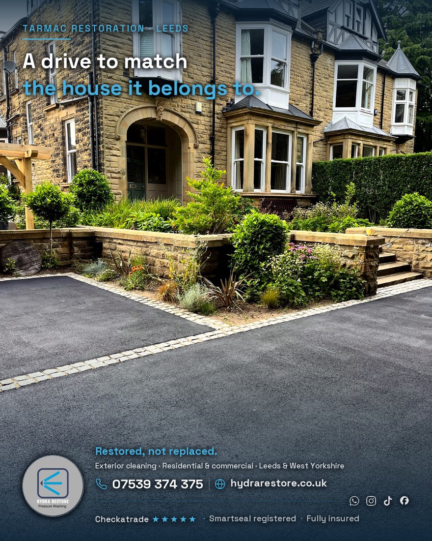
Hydra Restore is a specialist exterior-restoration trade in West Yorkshire: driveway and patio cleaning, render soft washing, decking, gutters, graffiti removal, and tarmac restoration that re-blacks a faded, oxidised drive back to a deep, even finish. It is a trade that lives or dies on the photograph. Nobody buys a driveway clean from a stock image, they buy it from a before-and-after of a drive that looks like theirs.
This case study is different from most in this set because we delivered two things at once: the creative (the visual assets the brand did not have) and the technical (the platform built to serve them). One workstream was designed around the other.
Not starting from zero: a rebuild, not a launch
Hydra Restore already had a website, on Wix, and had been putting content out. So this was not a first site. It was a rebuild and an upgrade of a business that was already trading and already trying to market itself.
Two things held the old setup back. The platform was a template that was slow and awkward to rank, and, more importantly, there were no real photographs of the work. On a Wix theme the transformations were essentially decorative, so the one thing a restoration buyer actually needs to see, a drive that looks like theirs, before and after, was missing. We replatformed the site onto Astro, carried the content approach forward and sharpened it, and produced the photography and social content the previous setup never had.
Why this was a creative job before it was a technical one
A lot of trade websites fail quietly for the same reason: they are a good template wrapped around placeholder photography. The structure is fine, but there is nothing to look at, so the site never earns the trust that turns a visitor into a phone call. That was exactly the gap on the old Wix site.
We took the opposite order. Before the new site was styled, we ran the shoots. That decision shaped everything downstream: the homepage, the gallery, the service pages and the before/after slider were all architected as slots waiting for real imagery, so the rebuild was never a shell pretending to be finished. It was a frame built to hold work we had actually produced.
The reveal: real before-and-afters, made to travel
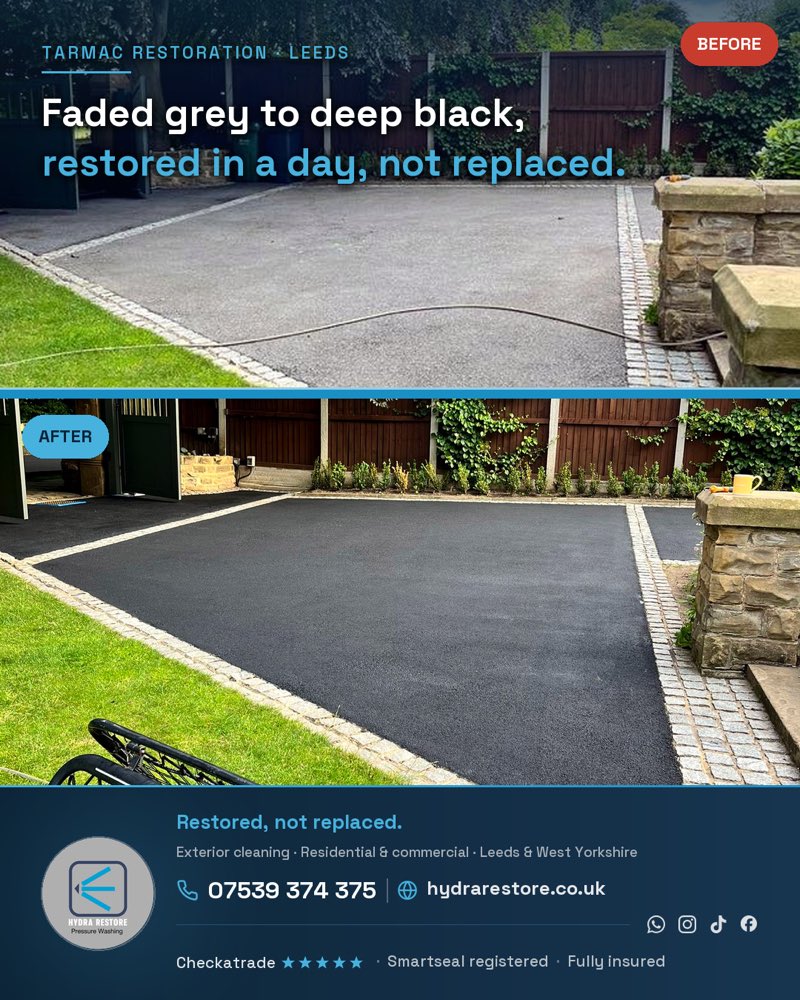
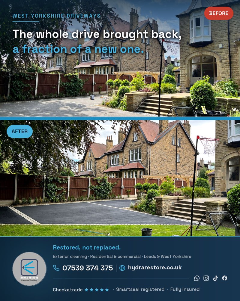
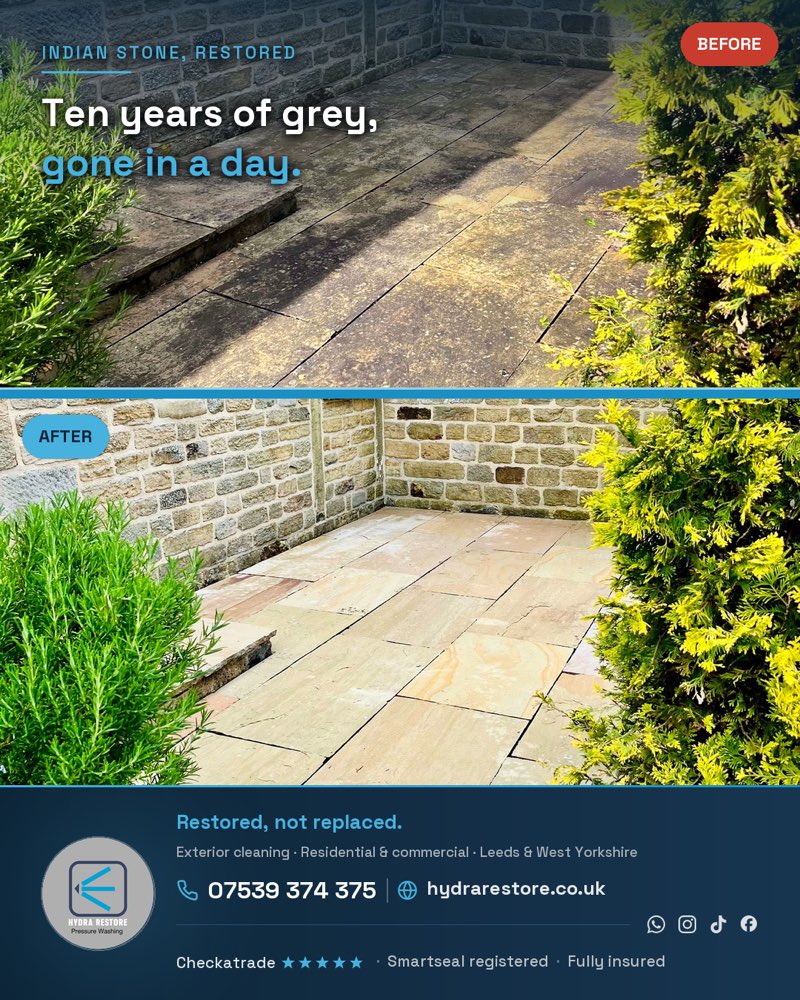
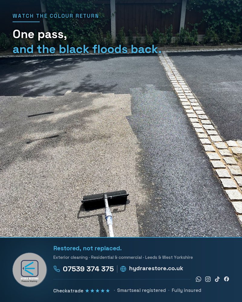
The heart of the work is the transformation. Every finished still is built as a self-contained, branded graphic: a benefit headline across the top and a footer lockup carrying the phone number, WhatsApp, the website and the trust line. So even when an image is screenshotted or reposted out of context, it still sells and still tells a homeowner how to book.
What we produced: 163 photos, 34 videos, and a graphics engine
The media production covered two real jobs and was fully catalogued, not dumped in a folder.
The flagship was a tarmac restoration on a large gritstone period property. We documented it across the full narrative arc: the faded, grey, oxidised “before”; the application itself; and the finished, deep-black “after”, including wide streetscape angles that put the finished drive against the house for kerb-appeal. A second job, a block-paving and Indian-stone patio, began to broaden the library beyond a single service.
Alongside the raw set we delivered:
- A curated, web-ready export (resized for immediate site use), with a crosswalk file mapping every renamed image back to its original so nothing is ever lost.
- A reproducible social-graphics engine: a Python script that renders 22 distinct designs in both feed (4:5) and Reels or TikTok (9:16) ratios, 44 assets in total, each with the brand tokens, a benefit headline, and the contact and trust footer. The point of building it as an engine rather than hand-designing each post is that the next batch is a re-run, not a re-do.
- A water-droplet brand identity, delivered as a full set of logo lockups plus a maskable app icon and a social avatar, documented so it stays consistent wherever it is used.
The “satisfying transformation” clips, a squeegee laying deep black over grey, are exactly the genre that travels on Reels and TikTok, so the video was cut with social in mind from the start.
A content strategy that compounds, not a one-off drop
The old content habit was scattered. We gave it a spine: five content pillars mapped to how this trade actually wins work.
- The reveal, the before-and-after graphics above, the highest-intent proof a restoration buyer can see.
- Oddly satisfying, the squeegee-application clips built for Reels and TikTok reach.
- Kerb appeal, the wide streetscape hero stills that sell the finished result against the house.
- Restored, not replaced, the educational angle that reframes a clean as an alternative to a four-figure new drive.
- Proof, review and trust overlays that land once real customer quotes are collected.
Every posting day also feeds a photo to the Google Business Profile, because on a local trade the before-and-afters on the profile lift Maps ranking directly. The strategy is built so the business, or we on a retainer, can keep it running without redesigning each time.
The website built to receive it: Astro on Vercel
The new site is a static Astro build on Vercel, with edge caching on static assets and self-hosted fonts, so there is no Google font CDN and no server runtime to slow the first paint, a step change from the old Wix template.
The architecture is built for a local trade that needs to be found for a lot of “service + place” searches without spinning up thin doorway pages:
- Surface-aware service pages, generated from a single data file, each with its own method explanation and service-specific FAQs. The driveway page talks about block paving, re-sanding and sealing; the render page explains why you soft wash render rather than blast it. Each page answers the concern a buyer of that specific service actually has.
- Hand-written area pages, not a find-and-replace of the town name. Each acknowledges the real character of the area, the property types, the shade and drainage, the surfaces that come up most there. That is the difference between a page Google reads as useful and one it reads as spam.
Proof you can drag, and booking the way a trade actually quotes
The gallery uses an accessible before/after drag-slider: keyboard-operable, properly labelled for screen readers, with a visible focus outline and lazy-loaded images. It is the single most persuasive element on a restoration site, so it was built to be usable by everyone, not just a mouse.
The quote path is deliberately WhatsApp-first. A homeowner standing on their drive wants to send a photo and a postcode, not fill in a ten-field form. The enquiry hands off to WhatsApp with the details pre-composed, and it is structured so a server endpoint can be connected as a one-line change when the business wants to take web leads directly. Underneath, the site carries structured data (a construction-business profile with the full service area, per-service and FAQ schema) so search engines understand what Hydra Restore does and where.
Honest about what is measurable
We will not dress this up with numbers we do not have. The rebuild is live, the media library and the social engine exist, and the content strategy is set, but the point of a case study is not to invent a traffic chart. The web enquiry form still hands off to phone and WhatsApp by design until the business is ready to take direct web leads, the social plan is ready to run rather than already banked, and the media is deep on tarmac while it grows across the other services, with a follow-up shoot planned for the team and van. Naming that honestly is the point. A partner who tells you the real state of your own project is worth more than one who ships a template and disappears.
Why this is a technical + creative partnership, not a website
Most agencies would have quoted the website and told the client to “send some photos.” The reason this engagement works is that the photos, the videos, the social engine, the brand marks and the platform came from the same place, built to fit each other. That is what UK Web Marketing increasingly is: a technical and creative partner that can produce the assets a brand does not have and build the platform that puts them to work, on an owned, accountable roadmap rather than a one-off drop.
If you run a trade or a service business whose product is genuinely visual, and you want the photography, the brand and the site built by one team that plans the next shoot with you rather than waiting for a brief, get in touch. We build and run it for you, with one accountable point of contact.